You have 40 feature requests and capacity to build 5. Every stakeholder has a different top priority. Every item on the list sounds important in isolation. Without a structured approach, you either default to gut feel or you default to whoever pushes hardest.
A prioritization matrix turns that list into a defensible plan. It forces you to compare features on the same dimensions — value and effort being the most common — so that the ranking reflects trade-offs rather than opinions.
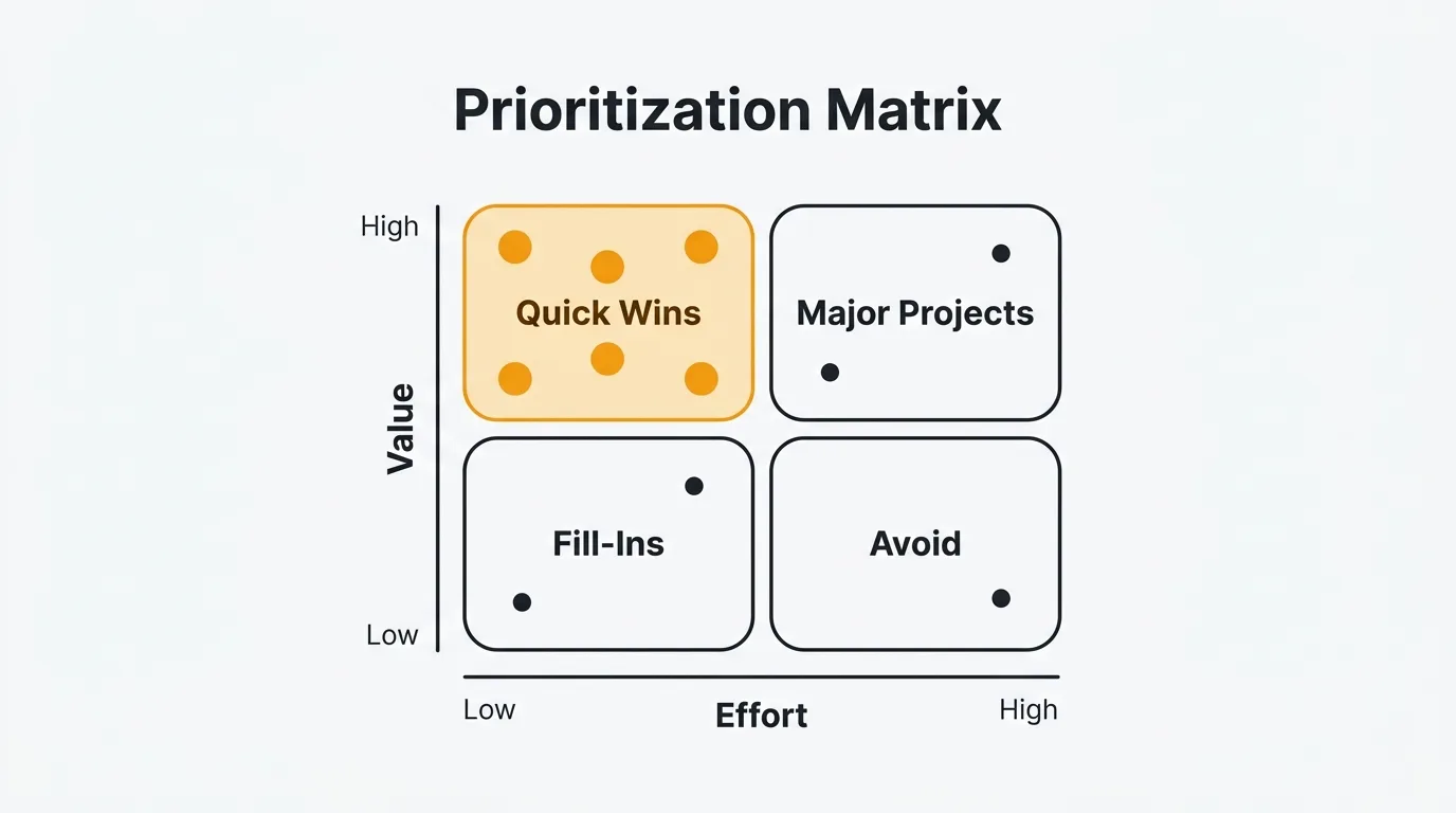
A prioritization matrix ranks features by scoring them on shared dimensions — most often value and effort — so you compare trade-offs instead of opinions. Use a simple 2x2 quadrant (Quick Wins, Major Projects, Fill-Ins, Avoid) for fast triage, or a weighted scoring model when many features cluster together. Feed it real feedback data — vote counts, comment sentiment, and customer segment — so the scores reflect evidence, not gut feel.
What is a prioritization matrix?
A prioritization matrix is a visual framework for comparing features across two or more dimensions. The most common dimensions are value (what you gain) and effort (what it costs). You score each feature on those dimensions, plot or sort the results, and use the output to decide what to build next.
The matrix doesn't make decisions for you. It surfaces trade-offs that are easy to miss when you're evaluating features one at a time. A feature that seems essential in isolation might look like poor value when you see it next to three alternatives that deliver comparable benefit at a fraction of the effort.
Prioritization matrices range from simple (a 2x2 quadrant diagram) to rigorous (a weighted scoring model with five or more criteria). The right level of complexity depends on your team's maturity and how much is at stake. Start simple. Add dimensions when the simpler version stops giving you the resolution you need.
The 2x2 value vs effort matrix
The 2x2 matrix is the simplest form. You assess each feature on two dimensions — value and effort — and place it in one of four quadrants. The quadrant tells you what to do with it.
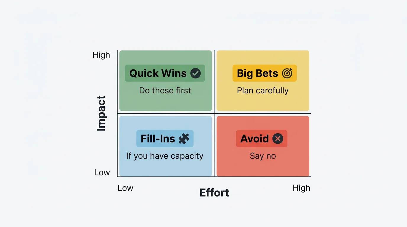
Quick Wins (high value, low effort): Do these first. The return on investment is highest here. These are the features where the gain significantly outweighs the cost.
Major Projects (high value, high effort): Plan carefully. These are worth doing, but they require scoping, sequencing, and resource allocation. Don't let them crowd out Quick Wins in the short term.
Fill-Ins (low value, low effort): Do these if you have capacity. They are harmless and marginally useful, but they shouldn't take priority over Quick Wins or well-planned Major Projects.
Avoid (low value, high effort): Say no. These features cost a lot and return little. Explicitly putting them in the Avoid quadrant is more useful than leaving them in an ambiguous backlog.
2x2 matrix template
Use this table as a starting point. Rate each feature High or Low on each dimension, assign the quadrant, and record your evidence.
| Feature | Value | Effort | Quadrant | Next action | Evidence |
|---|---|---|---|---|---|
| Feature name | High / Low | High / Low | Quick Win / Major Project / Fill-In / Avoid | Do now / Plan / Defer / Cut | Vote count, interviews, data |
The Evidence column is the one most teams skip. Fill it in. When you revisit the matrix in three months, you need to know why you rated something High Value — not just that you did.
Weighted scoring matrix
When the 2x2 isn't giving you enough resolution — for example, when most of your features land in the same quadrant — a weighted scoring matrix adds more structure. You evaluate each feature across multiple criteria, weight each criterion by its importance to your product strategy, score features 1–5 on each, and sum the results.
A typical set of criteria includes:
- Value: How much does this improve the experience for users who receive it?
- Reach: How many users does this affect?
- Strategic alignment: How well does this support your current product goals?
- Confidence: How certain are you about the value and reach estimates?
- Effort: How much engineering, design, and QA time does this require? (Lower effort = higher score, so invert this dimension.)
Weights reflect your priorities. A startup focused on acquisition might weight Reach heavily. A product optimizing retention might weight Value to existing users more. There is no universal weighting — set weights that reflect what your team is actually trying to accomplish right now.
Weighted scoring matrix template
Assign weights that sum to 100. Score each feature 1–5 on each criterion. Multiply score by weight, sum the results.
| Feature | Value (×25) | Reach (×20) | Strategic Fit (×20) | Confidence (×20) | Effort score (×15) | Total |
|---|---|---|---|---|---|---|
| Feature A | 4 → 100 | 3 → 60 | 5 → 100 | 4 → 80 | 3 → 45 | 385 |
| Feature B | 2 → 50 | 5 → 100 | 3 → 60 | 2 → 40 | 4 → 60 | 310 |
| Feature C | 5 → 125 | 2 → 40 | 4 → 80 | 5 → 100 | 2 → 30 | 375 |
In the Effort column, a score of 5 means very low effort (fast to build), and a score of 1 means very high effort (slow and expensive). Invert the scale so that low effort contributes positively to the total.
The output is a ranked list. Features A and C are close — that's a signal to discuss, not to blindly follow the number. The framework gets you to the right conversation, not past it.
How to estimate value
Value is the hardest dimension to score reliably. The most common mistake is conflating "this sounds important" with "this will move a metric we care about." Use concrete inputs wherever you can.
Feedback data is the most direct signal available. When users vote for a feature on your feedback board, you learn how many people want it and how urgently. Vote counts tell you about reach and demand. User comments tell you what problem the feature would solve and how much friction the current absence creates. A feature with 200 votes and comments like "I can't complete my workflow without this" has stronger evidence for high value than a feature a single enterprise customer mentioned on a call.
Customer segment matters for revenue impact. A request from 50 enterprise users on annual contracts may be worth more than 300 requests from free-tier users, depending on your business model. Weight your value score accordingly.
Strategic alignment is a distinct input from user value. A feature that supports your current acquisition strategy may be worth prioritizing even if relatively few users have requested it. A feature with 500 votes that doesn't align with your product direction might score lower than it appears at face value.
Competitive necessity is a special case. Some features don't create value — they prevent the loss of value. If a competitor ships something your users expect you to have, the cost of not building it is customer churn, not missed growth. These belong in the matrix with that framing explicit.
How to estimate effort
Effort should reflect total work, not just engineering time. The most consistent mistake teams make is scoping only the backend implementation. A complete effort estimate includes design, frontend, QA, documentation, and any launch or migration work.
Express effort in person-weeks or person-months and keep the unit consistent across all features. One engineer for two weeks is 0.5 person-months. Two engineers, one designer, and a QA pass over four weeks is approximately 3.5 person-months. If your team uses story points, you can use those — but make sure the scale is calibrated and agreed on by the team.
Get estimates from the people who will do the work. PMs consistently underestimate effort, especially for features they are excited about. Engineering estimates are more accurate when the spec is clear, so don't ask for an estimate before the feature is defined well enough to understand scope.
Flag uncertainty. An effort estimate with low confidence should be noted. "2 person-months, but we haven't scoped the data migration" is more useful than "2 person-months" when that assumption may be wrong.
Prioritization matrix template
This template combines the key columns from both the 2x2 and weighted scoring approaches. Use it as a starting point and adapt it to your team's criteria and weights.
| Feature | Value (1–5) | Effort (1–5) | Score | Quadrant | Evidence |
|---|---|---|---|---|---|
| Slack integration for notifications | 4 | 2 | 8 | Quick Win | 187 votes; mentioned in 12 support tickets |
| Onboarding checklist for new users | 5 | 3 | 8 | Quick Win | Retention data shows 3x improvement with guided setup |
| Advanced analytics dashboard | 3 | 5 | 6 | Major Project | Requested by 6 enterprise accounts; no vote data |
| CSV export for reports | 4 | 1 | 9 | Quick Win | 241 votes; users currently copy-pasting manually |
| Custom domain support | 3 | 4 | 7 | Major Project | 94 votes; required by 3 enterprise prospects |
| Dark mode | 2 | 2 | 4 | Fill-In | 45 votes; cosmetic preference, no workflow impact |
| AI-generated summaries | 2 | 5 | 4 | Avoid | Speculative; no user evidence; low confidence |
| Status page / public changelog | 3 | 2 | 6 | Quick Win | 112 votes; reduces "what's new?" support load |
In the Score column above, the numbers reflect a simple value minus effort calculation for illustration. In practice, use your actual scoring formula — either the weighted matrix or a custom formula your team agrees on. What matters is that every feature uses the same formula so the comparison is valid.
Using feedback data to fill the matrix
The matrix is a framework. Feedback data is the input. Without real data, you are assigning scores based on opinion and recency bias. With it, you are scoring based on evidence.
Vote counts inform your Reach and Confidence scores. A feature with 200 votes has demonstrated demand. A feature with 5 votes has not. When you see low confidence scores on features with high internal enthusiasm and low external evidence, that is useful information — it means the team's assumptions haven't been validated.
Comment sentiment informs your Value score. Browse the comments on your highest-voted features and look for patterns. Are users describing blocked workflows, or are they describing preferences? "I have to export to Excel and reformat everything manually every week" is a different level of value than "it would be nice if the colors matched our brand." Comments give you the qualitative context that vote counts alone cannot.
Customer segment is often surfaced by who is voting. If your top requested feature is coming primarily from enterprise accounts, the revenue impact is different than if the same votes came from free users. Understanding who is asking, not just how many, sharpens your value estimates.
Request frequency over time tells you about urgency. A feature that has received 10–15 new votes every week for six months has sustained demand. A feature that received 100 votes in a spike and then went quiet may be less urgent than the raw count suggests.
A feedback tool that captures all four signals in one place removes most of the manual collection work. Quackback surfaces vote counts, comment threads, and customer segment data on every request, and its voting board keeps the demand signal current. Because Quackback is open source, you can give every PM, engineer, and sales lead access to the same evidence. Its MCP server also lets you query that feedback data from an AI assistant — useful when you want to summarize the top requests in a segment before a scoring session, without copying anything into a spreadsheet.
For more on how to turn feedback into prioritization inputs, see how the RICE framework uses the same data and how MoSCoW uses feedback to scope releases. The matrix approach described here is complementary to both.
Other prioritization frameworks
The value vs effort matrix is the simplest starting point, but it is not the only option. Here is a brief comparison of the frameworks most product teams reach for.
| Framework | Output | Best for | Main limitation |
|---|---|---|---|
| Value/Effort matrix | Quadrant placement | Visual triage, team alignment | Oversimplifies when many features cluster in one quadrant |
| RICE | Numeric score | Comparing features objectively | Requires reliable data for Reach, Impact, and Confidence |
| MoSCoW | Category buckets | Scoping releases with stakeholders | No ranking within a category |
| ICE | Numeric score | Fast lightweight scoring | No Reach component; less rigorous than RICE |
| Kano model | Satisfaction categories | Discovery and strategic thinking | Requires user research; no build order |
| Weighted scoring | Ranked list | When criteria importance varies | Setup overhead; weights can hide assumptions |
Use the 2x2 matrix when you need a fast, visual way to triage a large backlog. Move to weighted scoring when the matrix doesn't give you enough resolution. Use RICE when you need a defensible numeric ranking across your entire backlog. Use MoSCoW when you are scoping a specific release with stakeholders who need to align on what is in and what is out.
These frameworks are not mutually exclusive. Many teams use MoSCoW to define scope, the value/effort matrix for a quick first pass, and RICE to sequence the final build order. The combination reduces the weaknesses of any single method.
For a broader comparison of tools that support these workflows, see best feature request tools and best feature voting tools. If you are evaluating specific platforms, Quackback vs Canny and Quackback vs Featurebase break down how the boards differ, and the docs cover scoring fields and exports in detail.
Try Quackback — open source with a managed cloud option. Start free. Get started | View on GitHub
Frequently asked questions
How is a prioritization matrix different from a RICE score?
A prioritization matrix is a visual or tabular framework that positions features relative to each other on two or more dimensions. RICE is a specific scoring formula — (Reach × Impact × Confidence) / Effort — that produces a single number for each feature. The matrix is broader and more flexible. RICE is more precise and formula-driven. Many teams use both: a matrix for a quick visual overview and RICE for a detailed numeric ranking when the stakes are higher.
How do you handle features that score the same?
When two features score identically or very close, the matrix has done most of its job — it has narrowed the decision to a genuine tie. Break the tie by looking at factors outside the scoring model: which feature has clearer scope, which one unblocks other work, which customer segment is asking for it, or which aligns better with your current product focus. A tie in the matrix means both are worth doing; the secondary question is sequencing, not selection.
Should you involve stakeholders in scoring?
Yes. Scoring as a group surfaces disagreements that would otherwise become scope conflicts later. A gap between a PM's and an engineer's effort score usually reveals an unstated scope assumption. Keep the group small — five to eight people — with a facilitator to move the discussion forward.
How often should you update the matrix?
Update it at the start of each planning cycle, typically quarterly. Between cycles, revise individual scores when significant new data arrives: a spike in feature votes, new user research findings, a change in team capacity, or a strategic pivot that shifts what "high value" means. Avoid the temptation to re-score weekly — the overhead erodes the framework's value. The matrix is most useful as a stable reference point within a planning horizon, not as a real-time dashboard.
Authored by James Morton
Founder of Quackback. Building open-source feedback tools.
Try Quackback
The open-source feedback platform. Boards, voting, and roadmaps.
Get startedStar on GitHub132