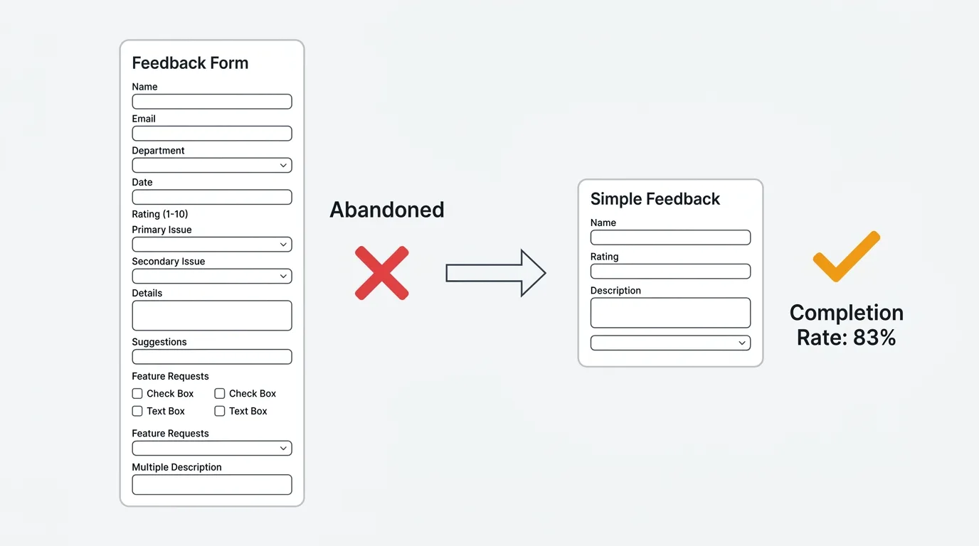
The average feedback form asks too many questions and gets abandoned halfway through. The best ones ask three to five questions and capture more useful signal than a twenty-field survey ever could.
A HubSpot analysis of 40,000 landing pages found that forms with three fields convert at roughly 25%. Forms with ten or more fields drop to 15%. Research from Zuko found that multi-step forms with one question per screen convert 86% higher than single-step forms with the same total fields. The design of your form determines how much feedback you actually collect.
This guide covers four feedback form templates for different use cases, the data behind optimal form length, and how to distribute forms for maximum response rates. These are general-purpose feedback forms — for survey-specific templates, see our guides on NPS surveys, CSAT surveys, and feature request templates.
What makes a good feedback form
A good feedback form maximizes the ratio of useful signal to respondent effort. Three principles:
Ask fewer questions, but the right ones. Every field you add reduces completion rates. A form with four fields and a 75% completion rate collects more total responses than a form with twelve fields and a 30% completion rate. Only include fields where the answer changes what you do next.
Lead with structure, follow with open text. Start with a structured question (rating, category dropdown, or multiple choice) that gives you sortable data. Follow with one open-ended question that gives you context. The structured field tells you what happened; the open text tells you why.
Make identity optional. Making email required kills anonymous feedback. Users who are frustrated or who have sensitive feedback will not submit it with their name attached. Include an email field but mark it optional with a note: "Include your email if you would like us to follow up." See our guide on why anonymous feedback gets more honest responses.
Four feedback form templates
1. General feedback form (3-4 fields)
Use this as your default catch-all feedback form. It works for any type of input — bugs, ideas, praise, complaints.
Fields:
| Field | Type | Required |
|---|---|---|
| What type of feedback is this? | Dropdown: Bug, Feature idea, Question, Praise, Complaint | Yes |
| Tell us more | Text area (max 500 chars) | Yes |
| How would you rate your overall experience? | 1-5 stars or emoji scale | No |
| Email field ("Include if you would like follow-up") | No |
Why it works: The category dropdown lets you route feedback automatically (bugs to engineering, feature ideas to product). The text area captures context. The rating gives you a trackable metric. The optional email enables follow-up without forcing it.
2. Bug report form (4-5 fields)
Use this when a user clicks "Report a bug" or submits from an error page. Structure matters here because engineers need specific information to reproduce the issue.
Fields:
| Field | Type | Required |
|---|---|---|
| What happened? | Short text (subject line) | Yes |
| What did you expect to happen? | Text area | Yes |
| Steps to reproduce | Text area | No |
| How severe is this? | Dropdown: Blocker, Major, Minor, Cosmetic | Yes |
| Screenshot or recording | File upload | No |
Why it works: The expected vs. actual framing forces users to articulate the gap, which is the most valuable information for debugging. Severity helps with triage. Steps to reproduce and screenshots are optional because requiring them dramatically reduces submission rates — some signal is better than perfect signal.
3. Feature suggestion form (3 fields)
Use this when a user clicks "Suggest a feature" or "Share an idea." The key insight: the "why" is more valuable than the "what."
Fields:
| Field | Type | Required |
|---|---|---|
| What do you need? | Short text (one-sentence description) | Yes |
| Why do you need this? | Text area ("What problem does this solve for you?") | Yes |
| How are you solving this today? | Text area ("Current workaround, if any") | No |
Why it works: The "why" field prevents solution-shaped requests ("add a Gantt chart") and surfaces the underlying problem ("I need to visualize task dependencies across teams"). The workaround field reveals urgency — if the current workaround is painful, the request is higher priority.
This is the same approach used by feature request boards with voting. The difference is that a form collects individual submissions, while a board lets users see existing requests and vote instead of duplicating them. For ongoing feature collection, a board is more efficient than a form.
4. Post-interaction form (2-3 fields)
Use this immediately after a specific event: support resolution, onboarding completion, feature first-use, or purchase.
Fields:
| Field | Type | Required |
|---|---|---|
| How easy was this experience? | 1-7 scale (for CES) or 1-5 stars (for CSAT) | Yes |
| What is the main reason for your rating? | Text area (shown conditionally for low ratings) | No |
| Anything else you would like to share? | Text area | No |
Why it works: The rating is fast (under five seconds to complete). The follow-up text area only appears for low ratings, which reduces form length for satisfied users while capturing detail from dissatisfied ones. This conditional logic is the single most effective technique for balancing completion rate with data richness.
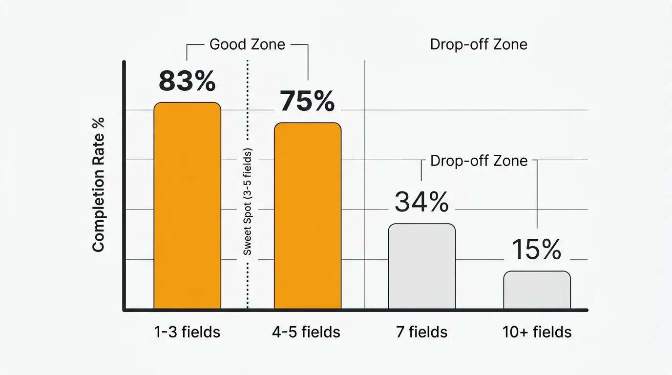
Optimal form length: what the data says
| Fields | Completion rate | Source |
|---|---|---|
| 1-3 | ~83% | Survicate |
| 3 | ~25% conversion (highest) | HubSpot (40K landing pages) |
| 4-5 | Minimal drop-off | Zuko |
| 7 or fewer | 34% conversion | Formstory |
| 10+ | 15% conversion | Formstory |
| 15+ | ~42% completion | Survicate |
The sweet spot is three to five fields. Below three, you may not capture enough context. Above seven, completion rates decline sharply. If you need more than seven fields, use multi-step forms with one or two questions per screen — they convert 86% higher than single-page forms with the same total questions.
Field type matters as much as field count. Zuko's data shows that standard text fields cause minimal drop-off, but large text areas and dropdown select boxes cause measurable abandonment. Use dropdowns sparingly and keep text areas short (limit to 500 characters).
How to distribute feedback forms
The channel you use to deliver the form affects response rates as much as the form itself.
| Channel | Response rate | Best for |
|---|---|---|
| In-app widget | 10-30% | Active users, contextual feedback |
| In-app survey | 10-30% | Post-action feedback |
| Post-support trigger | 30%+ | Support quality, CES |
| 1-5% | Inactive users, reflective feedback | |
| Website embed | Varies | Visitor feedback, pre-customer |
| QR code | Varies | Physical locations, events |
In-app forms get two to four times the response rate of email because you catch users when they are already engaged and the context is fresh. A feedback widget embedded in your product is the highest-conversion channel for ongoing feedback collection.
Smart triggers over broadcast. Show feedback forms after specific user actions (completed a task, used a feature for the fifth time, resolved a support ticket) rather than showing them to everyone. Contextual timing produces higher quality responses because the experience is fresh.
Forms vs. feedback boards
Feedback forms and feedback boards serve different purposes:
| Feedback form | Feedback board | |
|---|---|---|
| Best for | Structured one-time input | Ongoing feedback and prioritization |
| User experience | Fill out and submit | Browse existing ideas, vote, discuss |
| Deduplication | None (each submission is separate) | Built-in (users vote on existing items) |
| Visibility | Private (only your team sees it) | Public (users see each other's feedback) |
| Follow-up | Manual email if you have their address | Automatic status notifications to voters |
For collecting feedback at specific moments (post-support, post-onboarding), forms work well. For ongoing feature request collection and prioritization, a board with voting is more efficient because it aggregates demand automatically instead of creating duplicate submissions.
Many teams use both: a form for structured input at key touchpoints, and a board for ongoing feature discovery. Quackback combines both approaches — an embedded widget that captures feedback in-app, connected to a public board where users can see existing requests, vote, and track status.
Common form design mistakes
Asking too many questions. If your form has more than seven fields, you are collecting less feedback than a shorter form would — the completion rate math works against you.
Double-barreled questions. "How was checkout and shipping?" asks two things at once. The respondent has to choose which one to rate, and you cannot tell which they answered.
Leading questions. "How much did you love the new feature?" presupposes the answer. Ask "How would you rate the new feature?" instead.
Making email required. This kills anonymous feedback and reduces completion rates. Make email optional with a clear reason to share it.
No conditional logic. Showing every field to every user wastes their time. Show the severity dropdown only for bug reports. Show the follow-up text area only for low ratings. Conditional logic keeps forms short for most users while capturing detail when needed.
Wrong timing. Showing a feedback form during checkout, before a user has experienced the product, or immediately on page load annoys users and produces low-quality responses. Time forms to moments when the user has just completed an interaction and has something to say.
Frequently asked questions
How many fields should a feedback form have?
Three to five for most use cases. This balances completion rates with data richness. If you need more detail, use conditional logic to show additional fields only when relevant, or use a multi-step format with one to two questions per screen.
Should I use open-ended or structured fields?
Both. Lead with one structured question (rating, category, or multiple choice) for sortable data, then follow with one open-ended question for context. Limit open-ended fields to one or two per form — they cause more drop-off than structured fields and are harder to analyze at scale.
What is better — a form or a feedback widget?
A feedback widget is a form, but better. Widgets are embedded in your product, triggered contextually, and connected to a system that tracks, deduplicates, and prioritizes what comes in. Standalone forms (Google Forms, Typeform) collect submissions into a spreadsheet. A widget collects submissions into a feedback board with voting, status tracking, and notifications. If you are choosing between the two, a widget captures more feedback with less effort for both you and your users.
How do I analyze open-ended feedback at scale?
Manual analysis works up to about 50 responses per month. Beyond that, use AI-powered feedback analysis to detect themes, sentiment patterns, and duplicates automatically. Most feedback tools offer some level of automated categorization. For teams handling hundreds of submissions per month, manual analysis becomes a bottleneck.
Should feedback forms be anonymous?
Offer anonymous submission as an option, not a requirement. Make email optional with a note explaining why they might want to include it ("so we can follow up with you"). This gives you identified feedback from users who want follow-up and anonymous feedback from users who want honesty. Both are valuable.
Authored by James Morton
Founder of Quackback. Building open-source feedback tools.
Try Quackback
The open-source feedback platform. Boards, voting, and roadmaps.
Get startedStar on GitHub132